Michigan Primary Care Associates (MiPCA) is a comprehensive primary care practice offering relationship-driven, preventative-focused healthcare. By looking beyond symptoms and taking time to truly understand each patient, MiPCA supports long-term wellness through personalized care, lifestyle guidance, and advanced treatment options.
The Ask: To develop a cohesive and meaningful brand identity for Michigan Primary Care Associates that builds recognition, unifies marketing efforts, and reflects a trusted, patient-centered approach to care. These brand guidelines will help ensure consistency across all touchpoints while supporting MiPCA’s commitment to thoughtful, proactive healthcare.
Services: Visual Brand Identity, Brand Strategy, Print Collateral
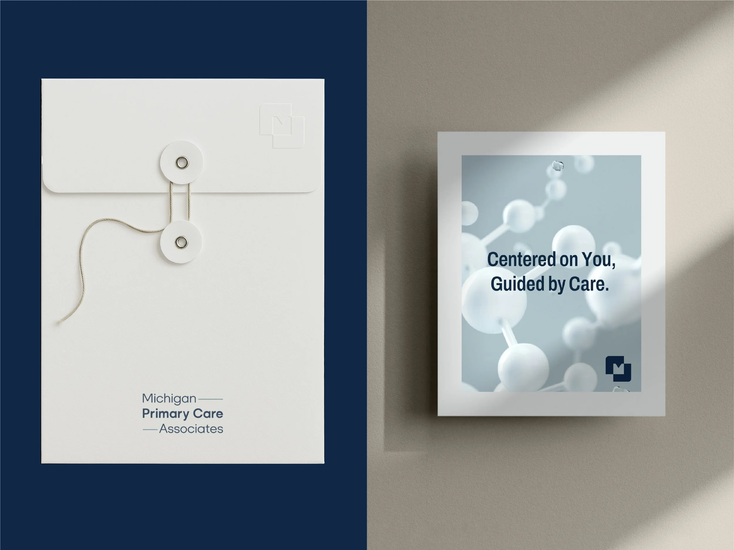
Design Solution: I grounded MiPCA’s visual direction in a balance of professionalism and progress. The identity feels modern, strong, and trustworthy, while remaining welcoming and inclusive, supporting a patient-centered approach to care.
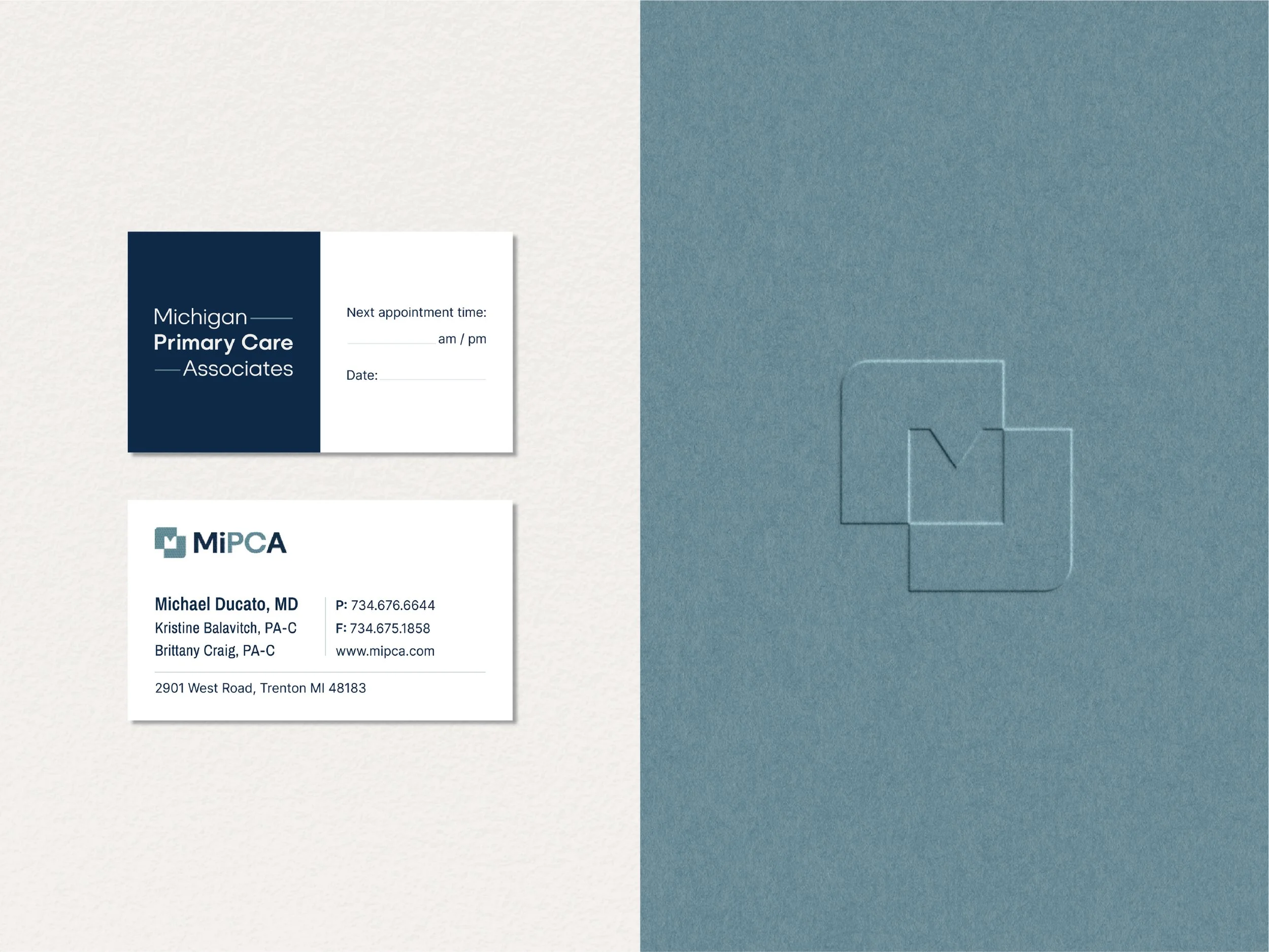
The primary wordmark is set in a clean, modern, geometric sans-serif, selected for its clarity and approachability, with subtle refinements tailored to MiPCA. A neutral color palette establishes credibility and longevity, while a soft blue accent references healthcare, safety, and reassurance.
The brandmark is intentionally simple yet layered with meaning. The negative space subtly forms an “M,” nodding to Michigan and the practice’s name. Its shape suggests upward arrows, symbolizing progress and feeling your best, and is derived from a deconstructed medical “+” mark, reflecting MiPCA’s forward-moving, holistic approach to care.
Brand Design & Brand Strategy by Alicia Cox Designs